Leveraged Labs: Brand Identity
Client:
Leveraged Labs
The Brief:
The client required a cohesive and instantly recognizable visual identity to serve as a strong, professional anchor for their brand and its community, balancing analytical precision with contemporary digital culture.
Deliverables:
Primary Logo & Visual System Design · Brand Identity Guidelines · Creative Asset Development · Concept Artwork & Visual Direction.
OVERVIEW:
Leveraged Labs needed a powerful visual identity that communicated expertise and trust in the fast-moving Web3 space.
Leveraged Labs needed a powerful visual identity that communicated expertise and trust in the fast-moving Web3 space.
As Creative Director and Lead Artist, I partnered directly with the founder to design a comprehensive and relevant brand.
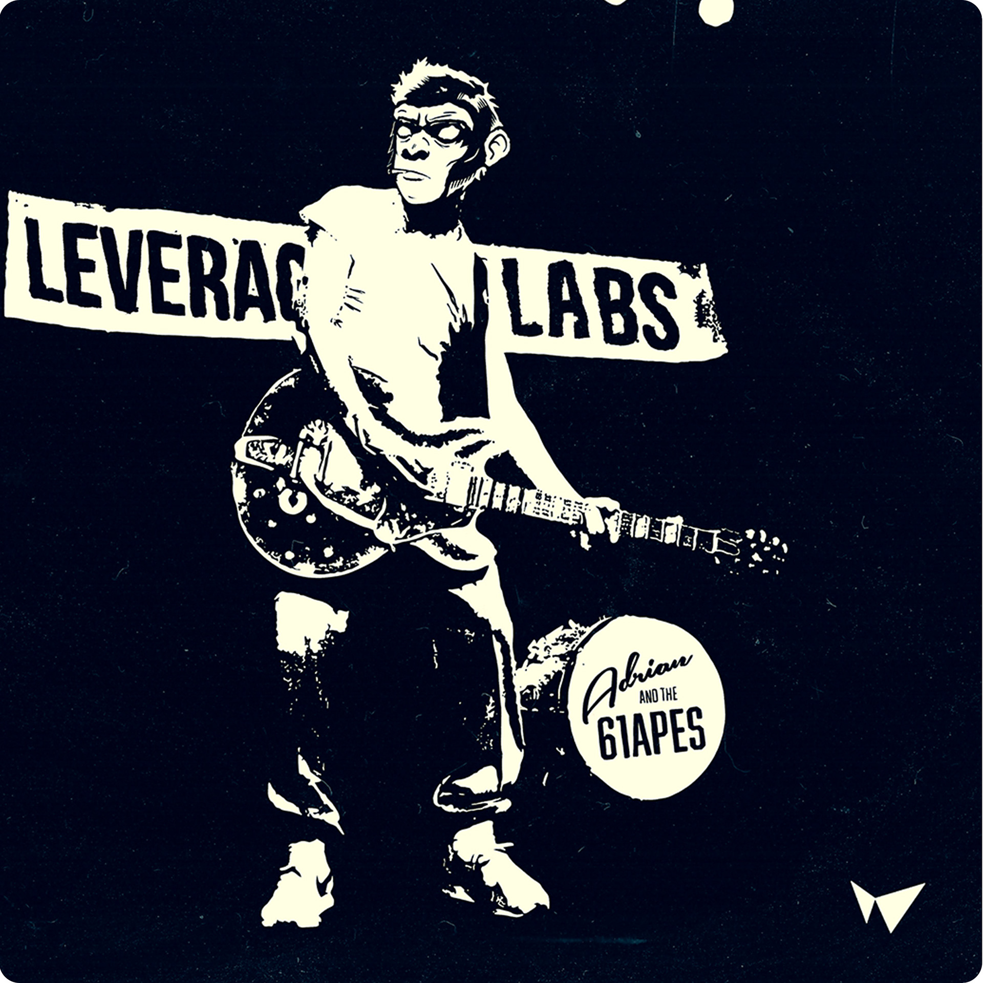
The visual system was designed to give a strong, professional presence in the Web3 space and create a foundational identity for their community projects, including the 61Apes.

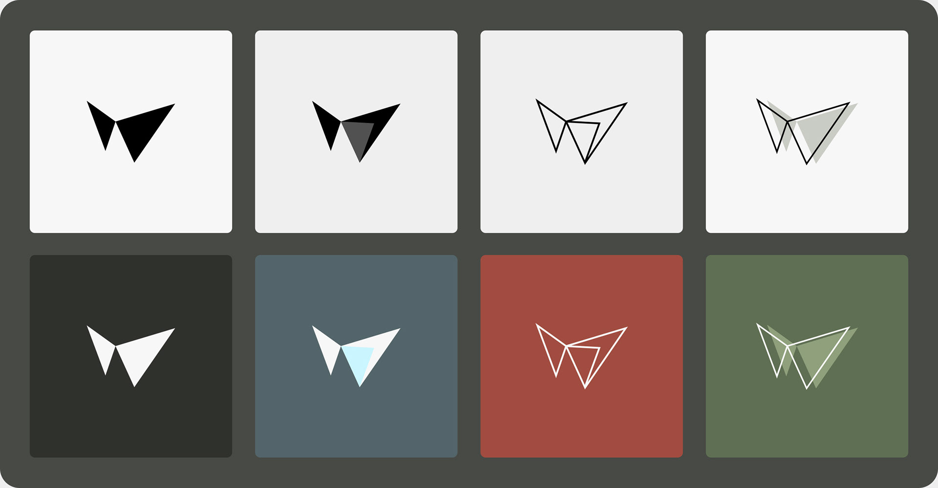
Conceptual Geometry: The 0.618 Harmonic
The brandmark was strategically derived from the Fibonacci 0.618 "W" Harmonic, merging sharp, analytical lines with a balanced, adaptable form.
Crucial to the design, this element immediately grabs attention and defines the overall look.
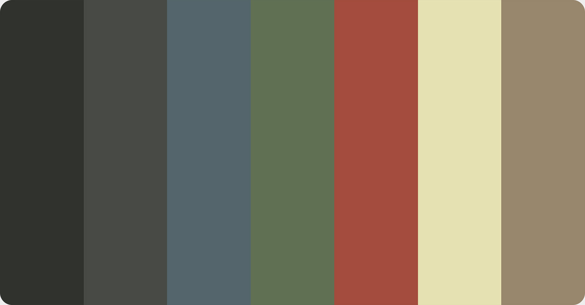
The Visual System and Palette
The identity system required versatility.
We established a seven-color palette, inspired by traditional Japanese Kuniyoshi art, to ensure high visual contrast and flexibility across various applications—from monochromatic digital interfaces to full-color merchandise.
We established a seven-color palette, inspired by traditional Japanese Kuniyoshi art, to ensure high visual contrast and flexibility across various applications—from monochromatic digital interfaces to full-color merchandise.
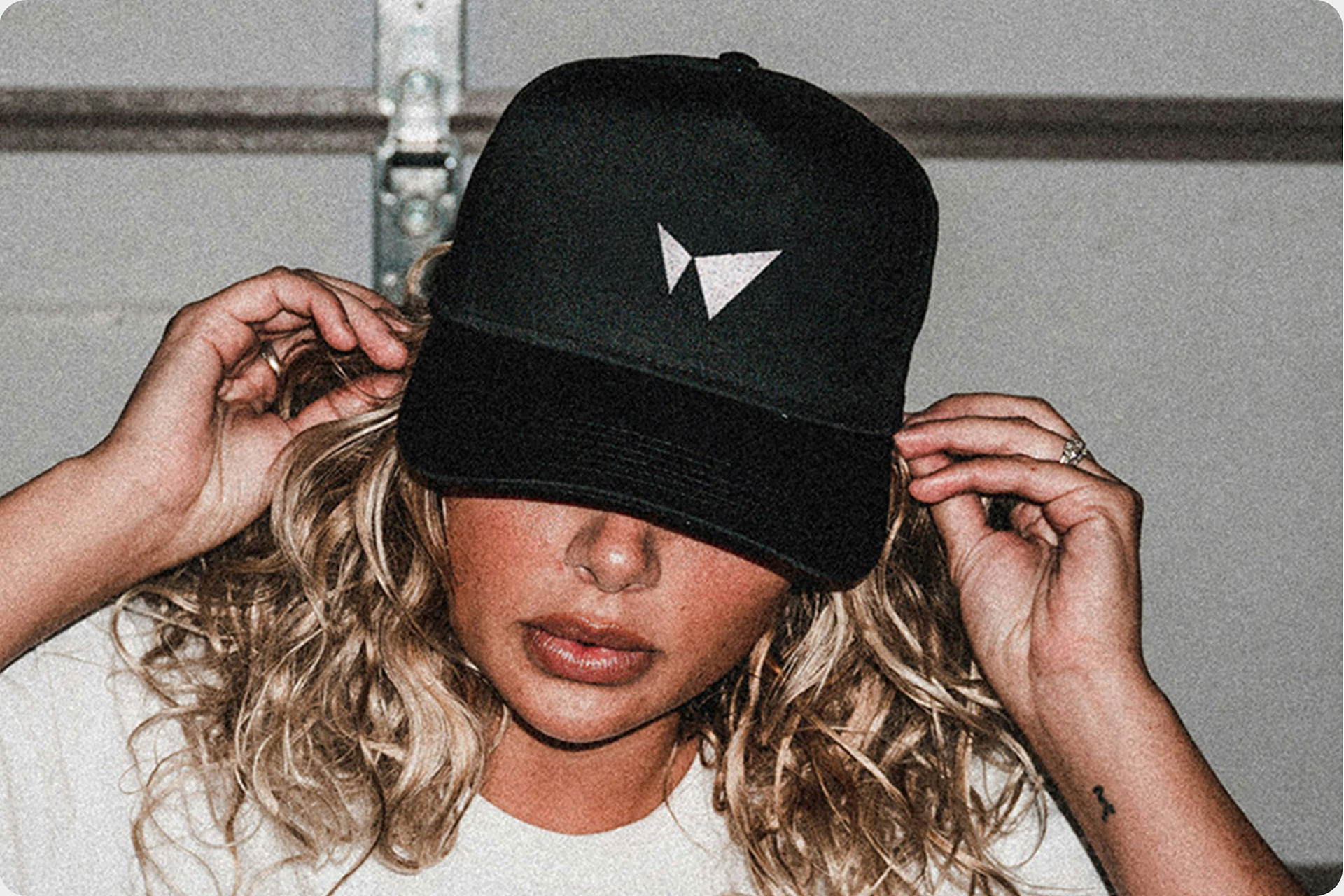
Application & Cultural Impact
The integrated brand system was immediately deployed across merchandise, social media campaigns, and digital platforms to rapidly build brand recognition and cultural adoption. This work was critical in creating a consistent visual ecosystem that anchored the success of the 61Apes launch.