Philanthropic Life (Disruptive Innovation)
CLIENT:
Philanthropic Life (Non-Profit Life Insurance Brokerage)
THE BRIEF:
Develop a comprehensive, trust-inspiring brand identity that communicates stability, ethical mission, and professional service, replacing dated visuals with a modern, credible system.
DELIVERABLES:
Primary Logo & Brand Mark Suite (The Conjoined Hands Icon) · Cinzel/Montserrat Typography System · Comprehensive Color Palette (Oxford Blue/Secondary Finacial Colors) · Professional Digital Stationery & Outreach Templates.
OVERVIEW:
Philanthropic Life needed a brand identity that was both trustworthy (critical for a brokerage) and mission-aligned (essential for a non-profit).
Philanthropic Life needed a brand identity that was both trustworthy (critical for a brokerage) and mission-aligned (essential for a non-profit).
My task was to design a cohesive visual system that balanced professional gravitas with warmth and ethical commitment. The final identity was built to be scalable and functional for both high-end digital outreach and mandatory professional documentation.
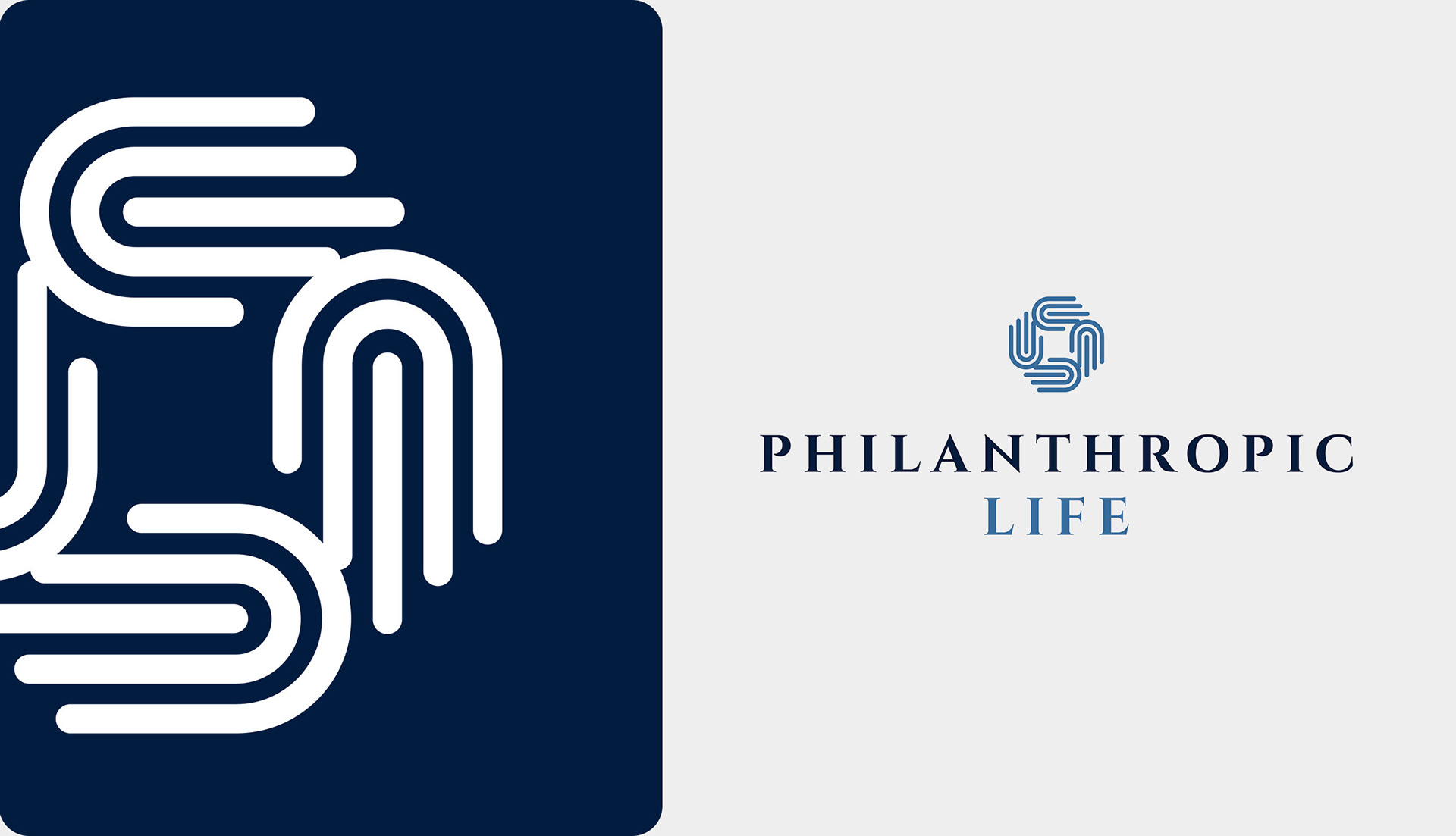
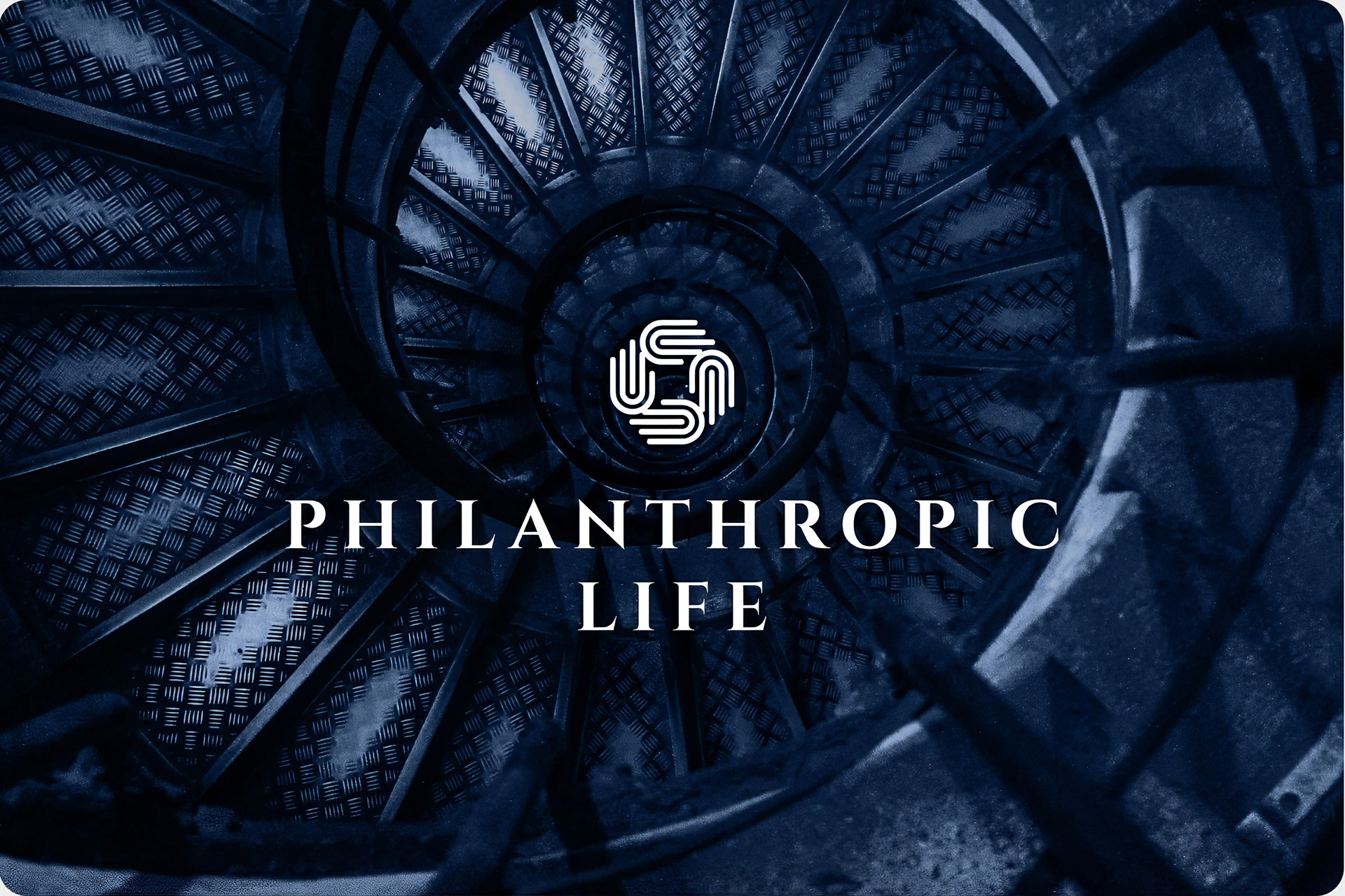
Icon: Compassion and Future Focus
The central icon—the circular conjoined hands—signals compassion and humanity, speaking directly to the company's heart for those in need.
This mark, paired with the classic-yet-modern Cinzel wordmark, immediately establishes the necessary balance between ethical purpose and financial professionalism.
The primary color, Oxford Blue (#011C40), was chosen to signal heritage, quality, and integrity
This mark, paired with the classic-yet-modern Cinzel wordmark, immediately establishes the necessary balance between ethical purpose and financial professionalism.
The primary color, Oxford Blue (#011C40), was chosen to signal heritage, quality, and integrity
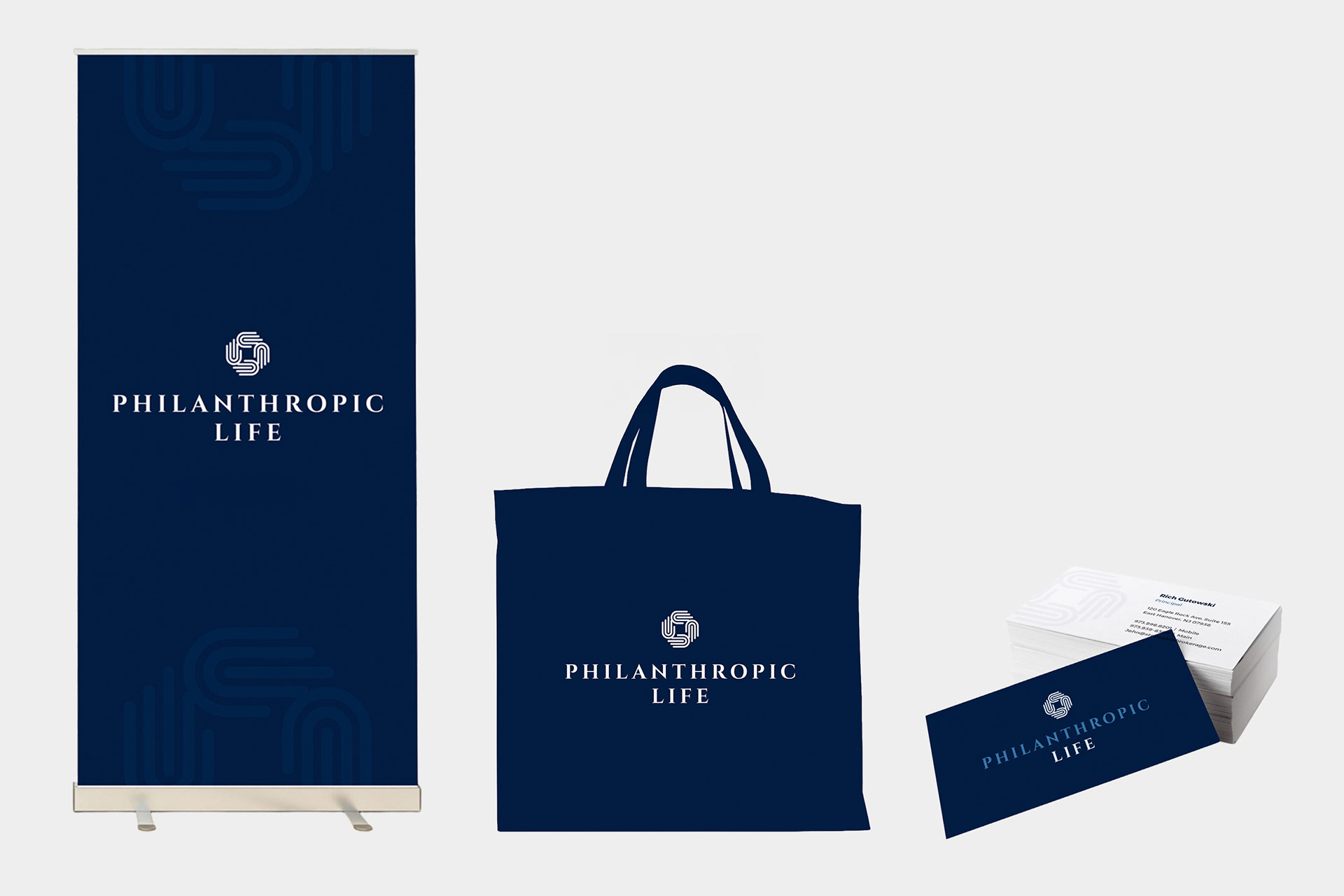
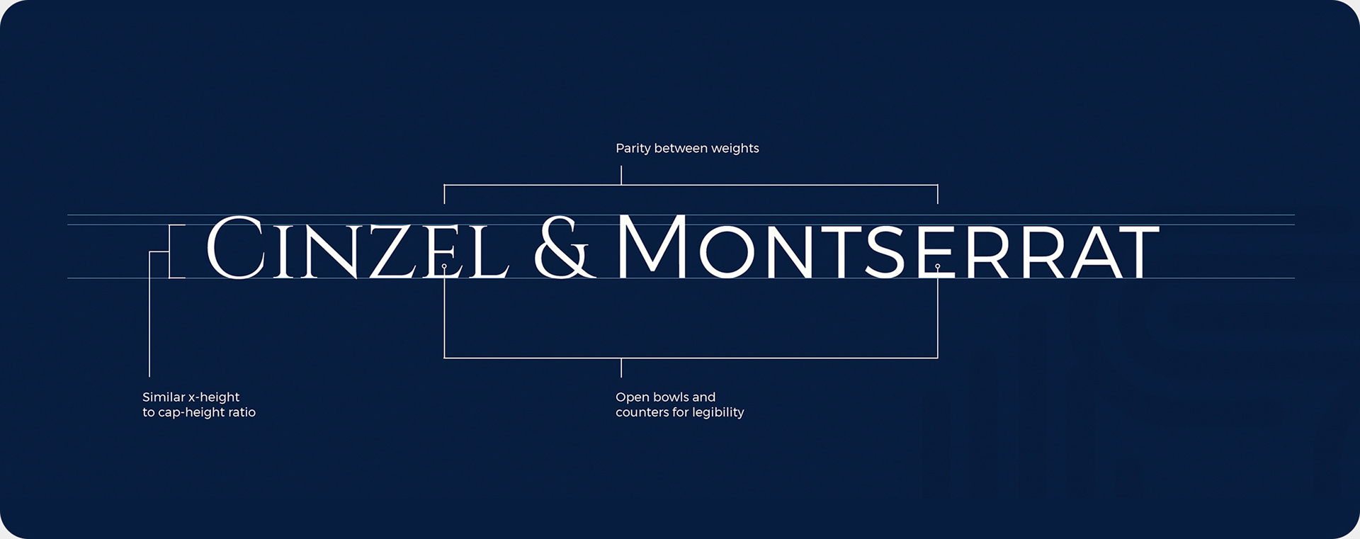
A System Built for Credibility
I created a robust application system utilizing the serif/sans-serif combination of Cinzel (for headlines/hierarchy) and Montserrat (for body copy/legibility) to ensure maximum impact across all mediums.
This system was deployed across essential professional touchpoints, including business cards, roll-up banners, and data visualization tools, reinforcing stability in every piece of communication.
This system was deployed across essential professional touchpoints, including business cards, roll-up banners, and data visualization tools, reinforcing stability in every piece of communication.
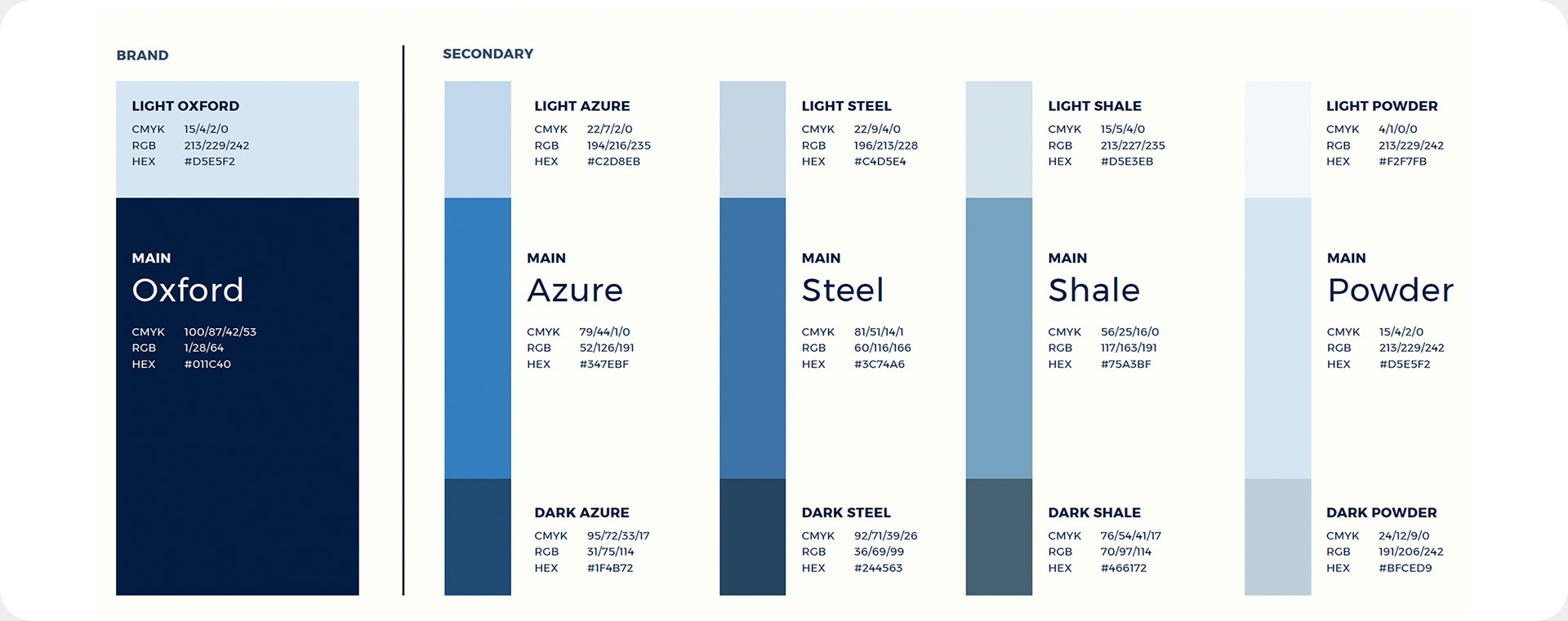
Supporting Information-Rich Communication
A full color palette was developed, inspired by traditional finance colors, specifically for visualizing data and creating informational graphics.
This functionality ensures the brand identity supports the brokerage's need to present complex financial information clearly and credibly, demonstrating the system’s utility beyond basic marketing assets.
This functionality ensures the brand identity supports the brokerage's need to present complex financial information clearly and credibly, demonstrating the system’s utility beyond basic marketing assets.