Underground Alpha.
Serious Craft.
Leveraged Labs is a serious trading community — stocks, bonds, commodities, crypto — built around real expertise and underground culture. The knowledge is institutional. The energy is anything but.
The brand had to match that energy — credible enough for serious traders, sharp enough for the culture. Something that hits different when you know what you're looking at.
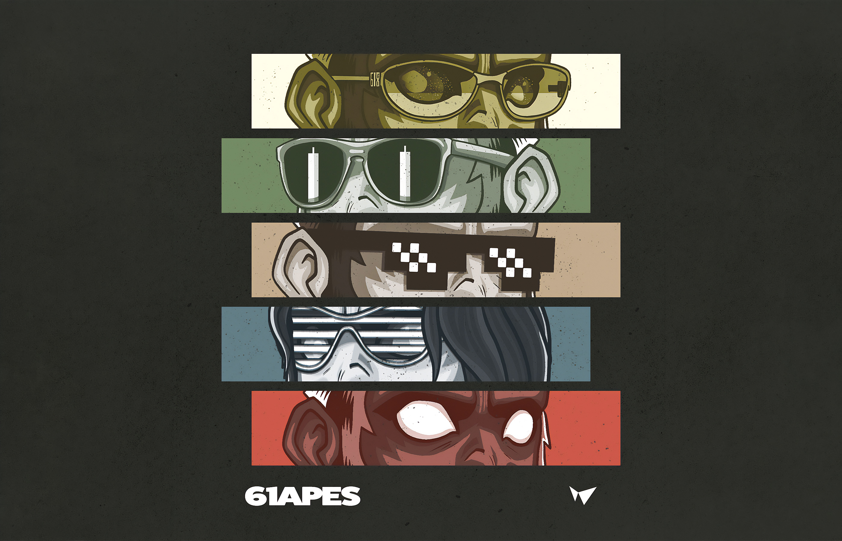
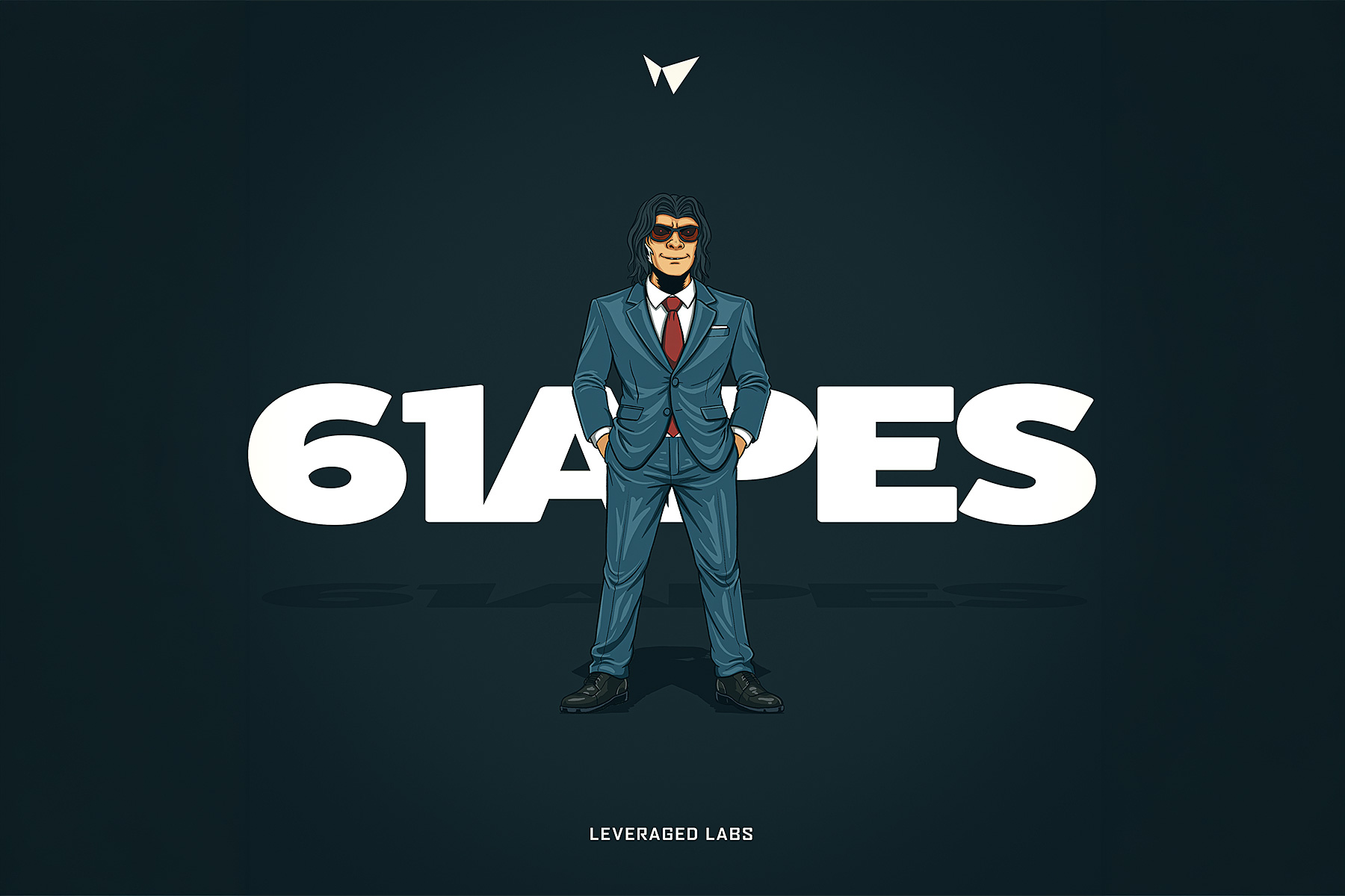
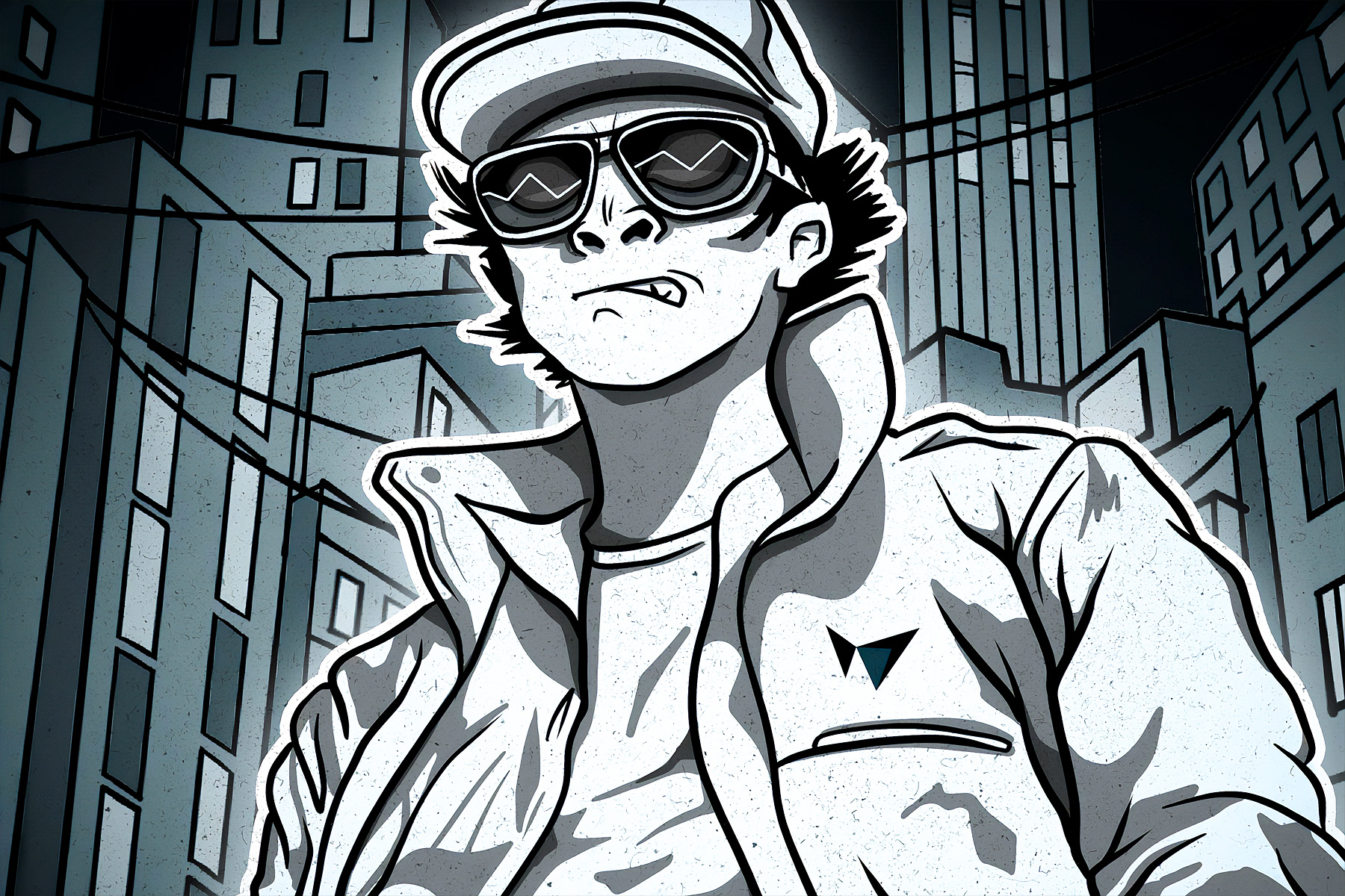
This identity also had to serve as the visual foundation for the 61Apes — the community mascot built directly on top of it. One mark. Two brands. Both earned.

The brandmark was derived from the Fibonacci 0.618 "W" Harmonic — the most significant retracement level in technical analysis. Traders use it every day to identify price levels, spot reversals, and time entries. It isn't decorative geometry. It's the actual language of their craft, embedded in the mark. The form reads simultaneously as the letters 'LL' and a compass bearing. The ambiguity is intentional. You see what you know.
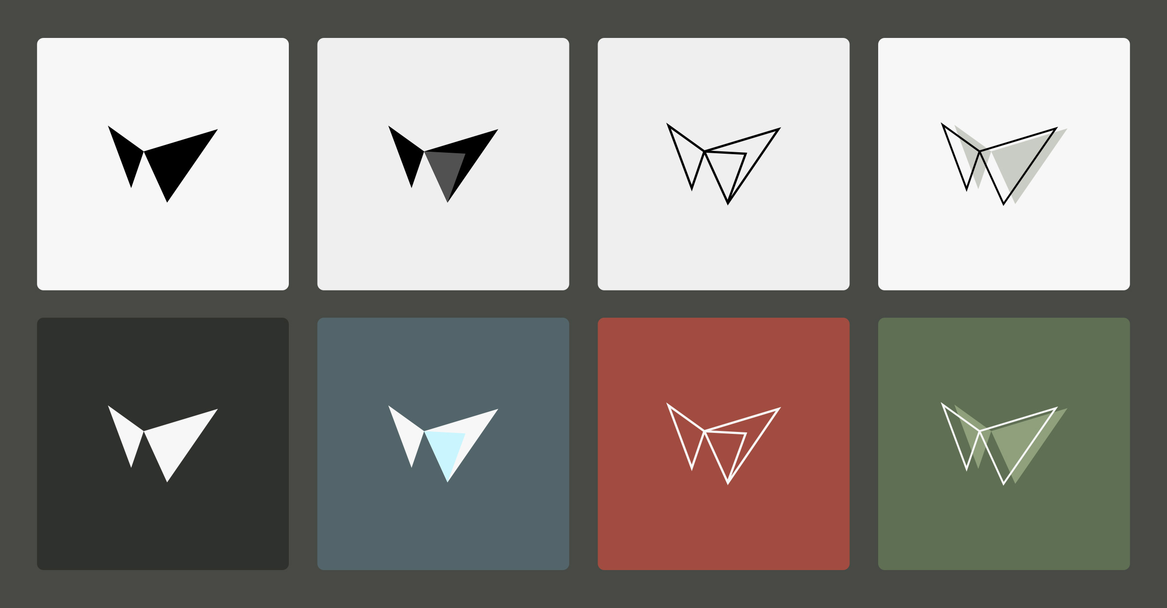
A six-color palette — inspired by traditional Japanese Kuniyoshi woodblock art — was built to ensure maximum visual contrast and flexibility. From monochromatic digital interfaces to full-color merchandise, each colorway gives the mark a distinct personality while maintaining system coherence.
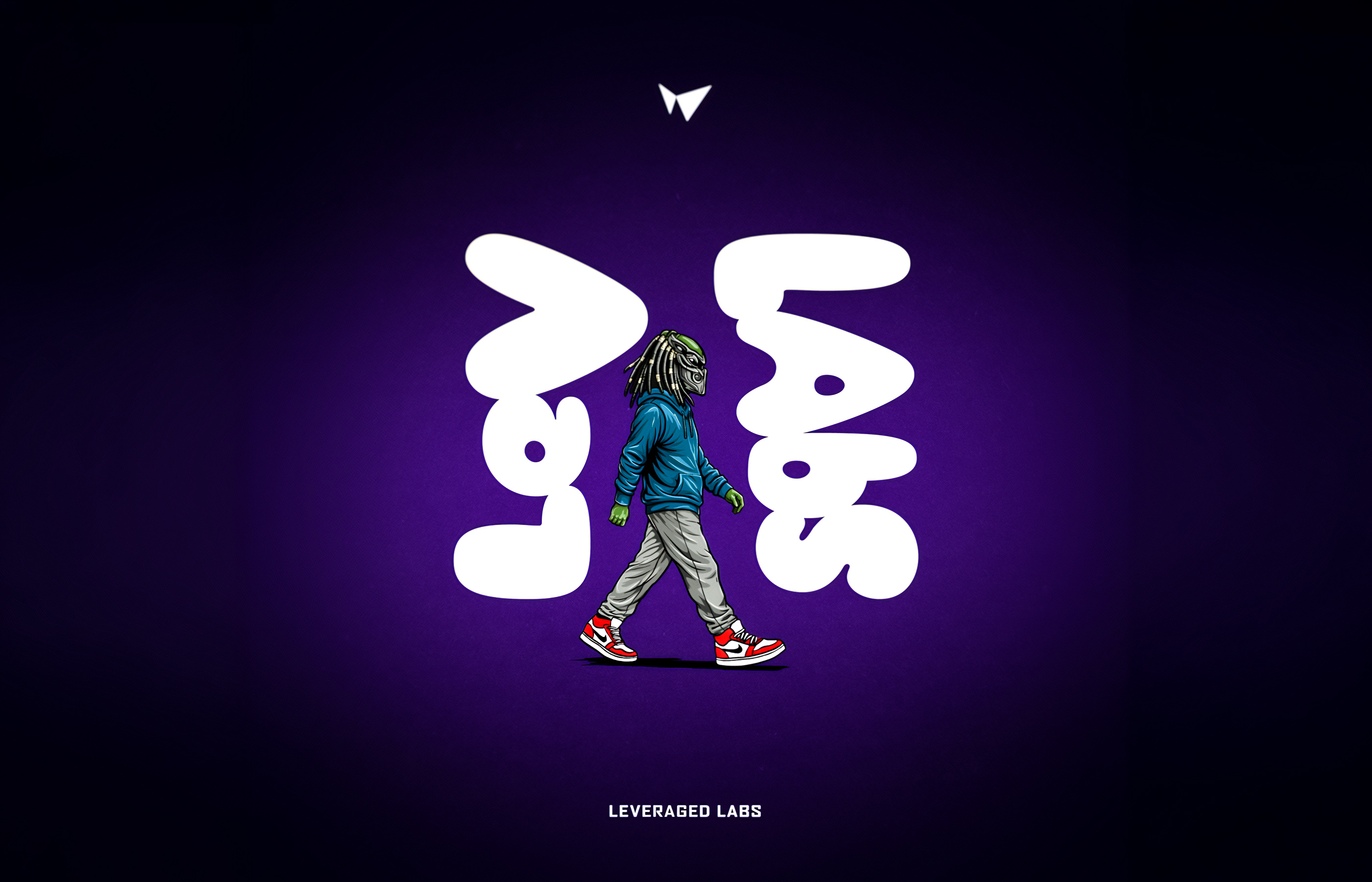
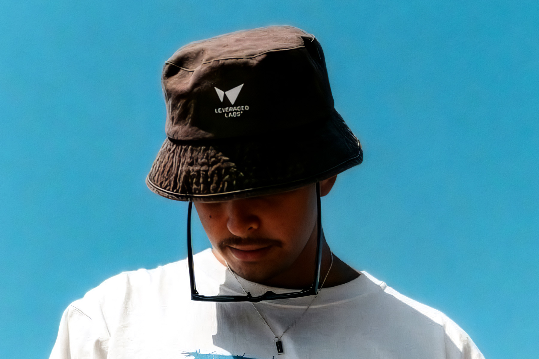
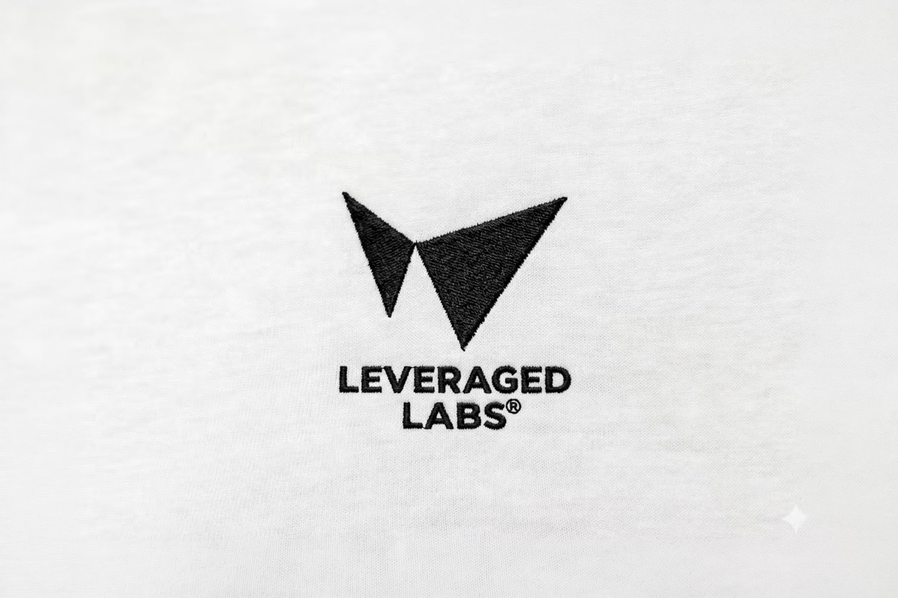
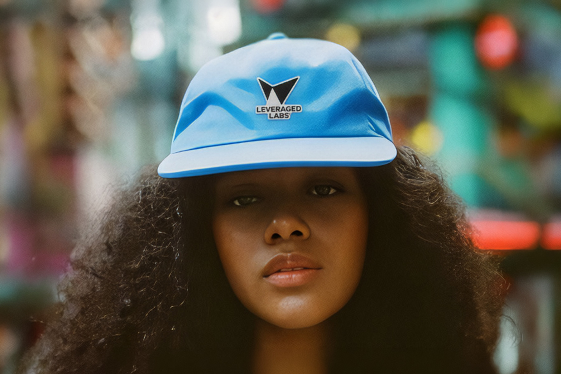
A brand lives or dies in application. This one was put to work immediately — community assets, social campaigns, digital platforms, merchandise. The mark's geometric precision holds at every scale: a Discord avatar, a hat brim, a banner behind a live stream. The six-colorway system means every piece of merch has its own identity while staying unmistakably LL. And when the 61Apes launched on top of it, the foundation held — because it was built to.
Full identity system: mark, 6-color palette, logo variations, merchandise, community assets, and visual direction
One mark.
Two brands.
The Leveraged Labs identity did what the best brand systems do — it created a foundation strong enough to support a sub-brand. The 61Apes launched on top of it, inheriting the visual logic and extending it into character and community. The parent brand stayed sharp; the sub-brand got personality.
The identity continues to evolve with the community, a living system rather than a static deliverable. That's the measure: a brand that scales with the people who wear it.