Luxury Nonprofit.
No Contradiction.
Philanthropic Life needed a brand identity that was both trustworthy — critical for a brokerage — and mission-aligned, essential for a non-profit. Those two things usually fight each other. The task was to resolve the tension.
My task was to design a cohesive visual system that balanced professional gravitas with warmth and ethical commitment. The final identity needed to be scalable and functional for both high-end digital outreach and mandatory professional documentation.
Every touchpoint was designed with restraint and intention. Nothing loud. Nothing cheap. Everything earned.
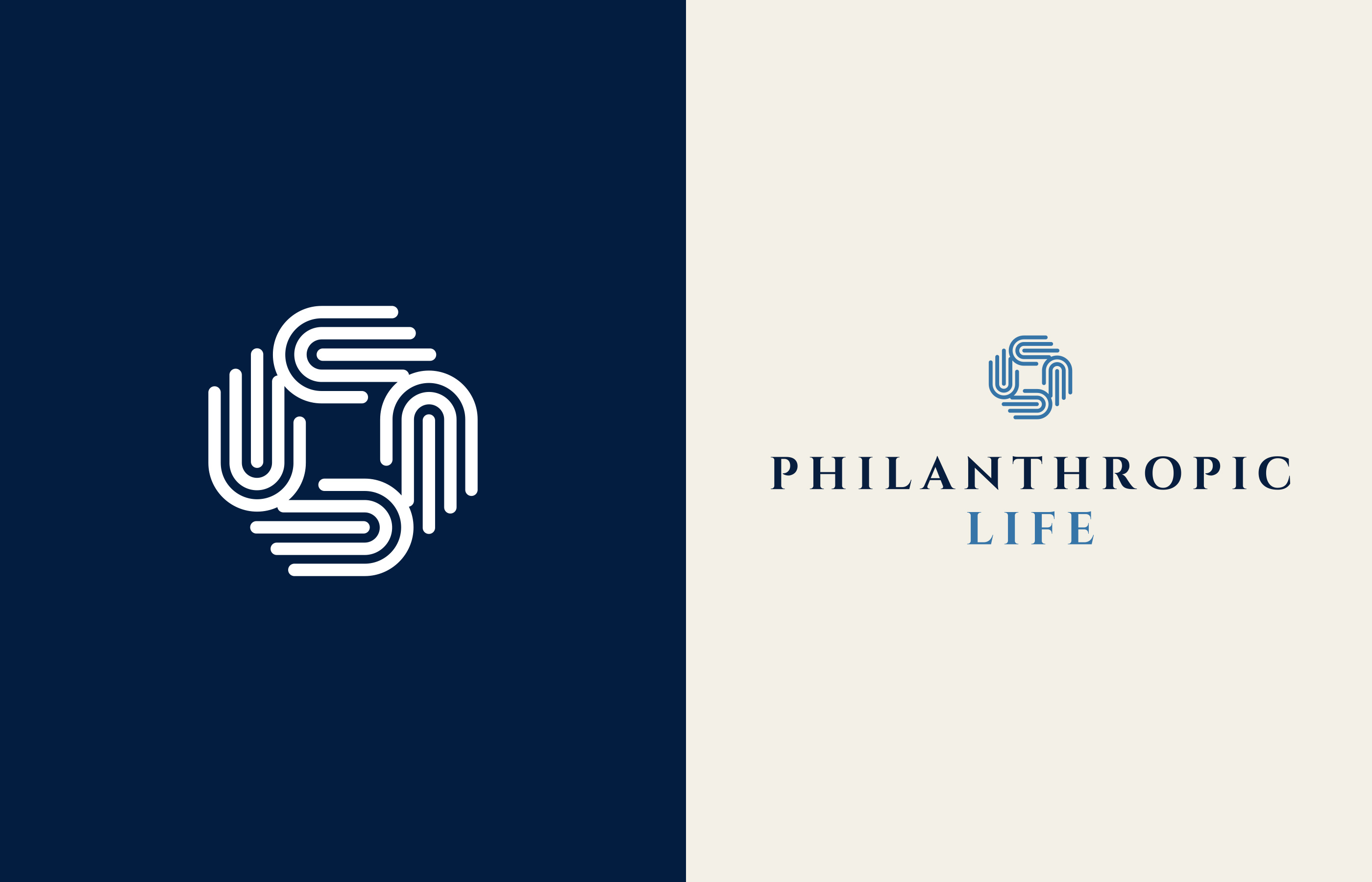
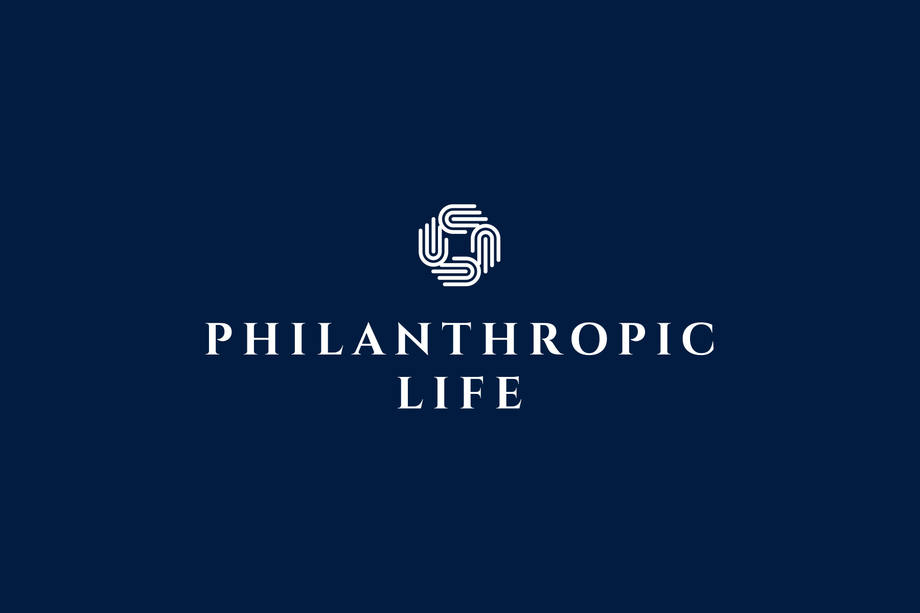
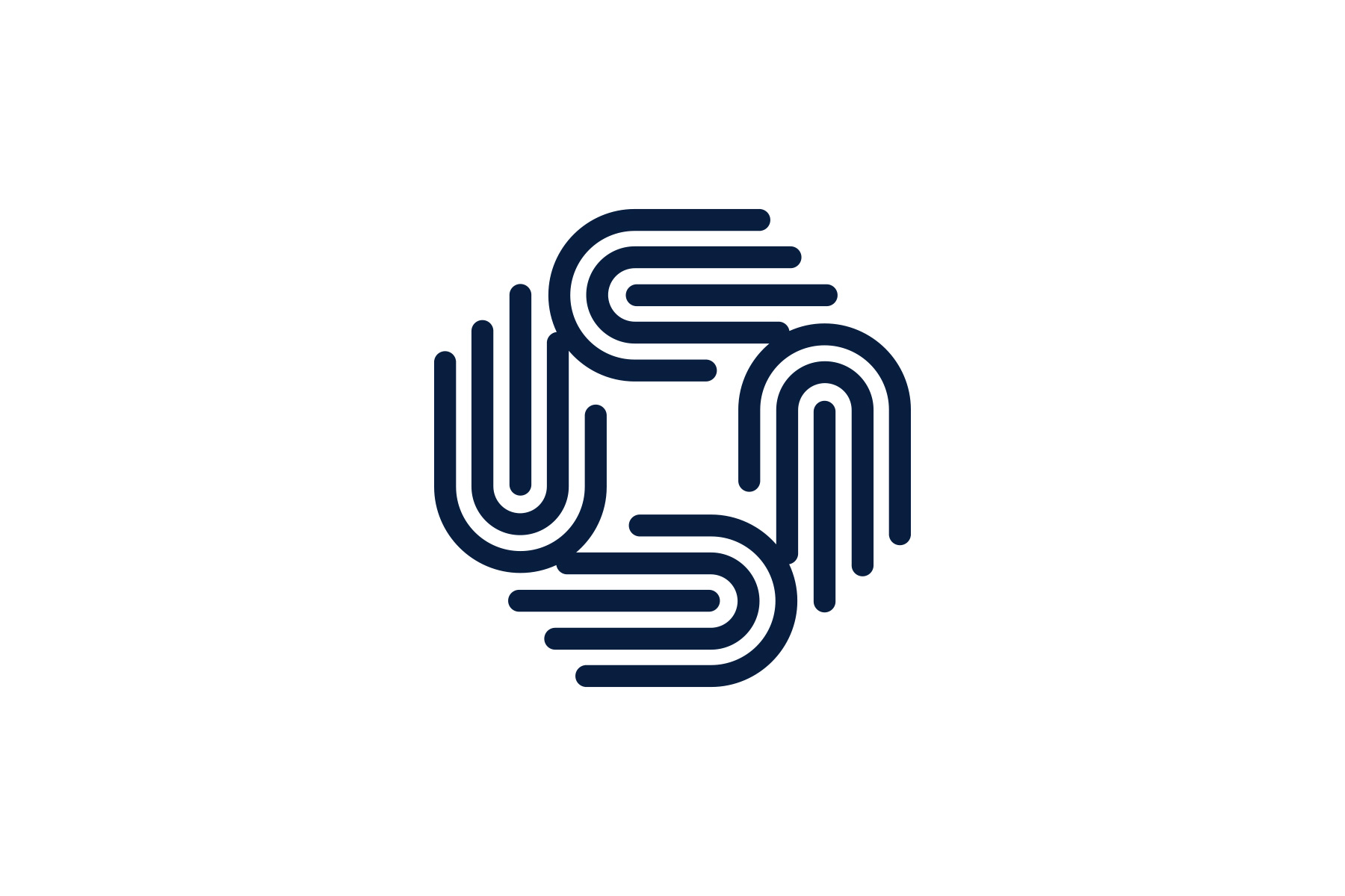
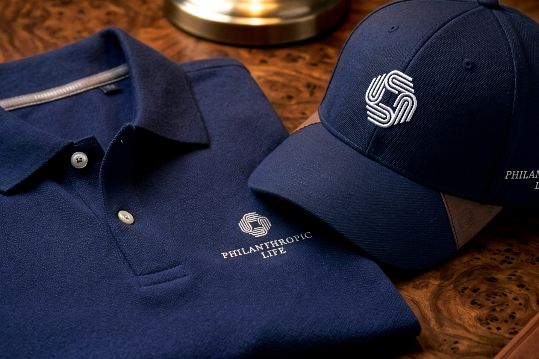
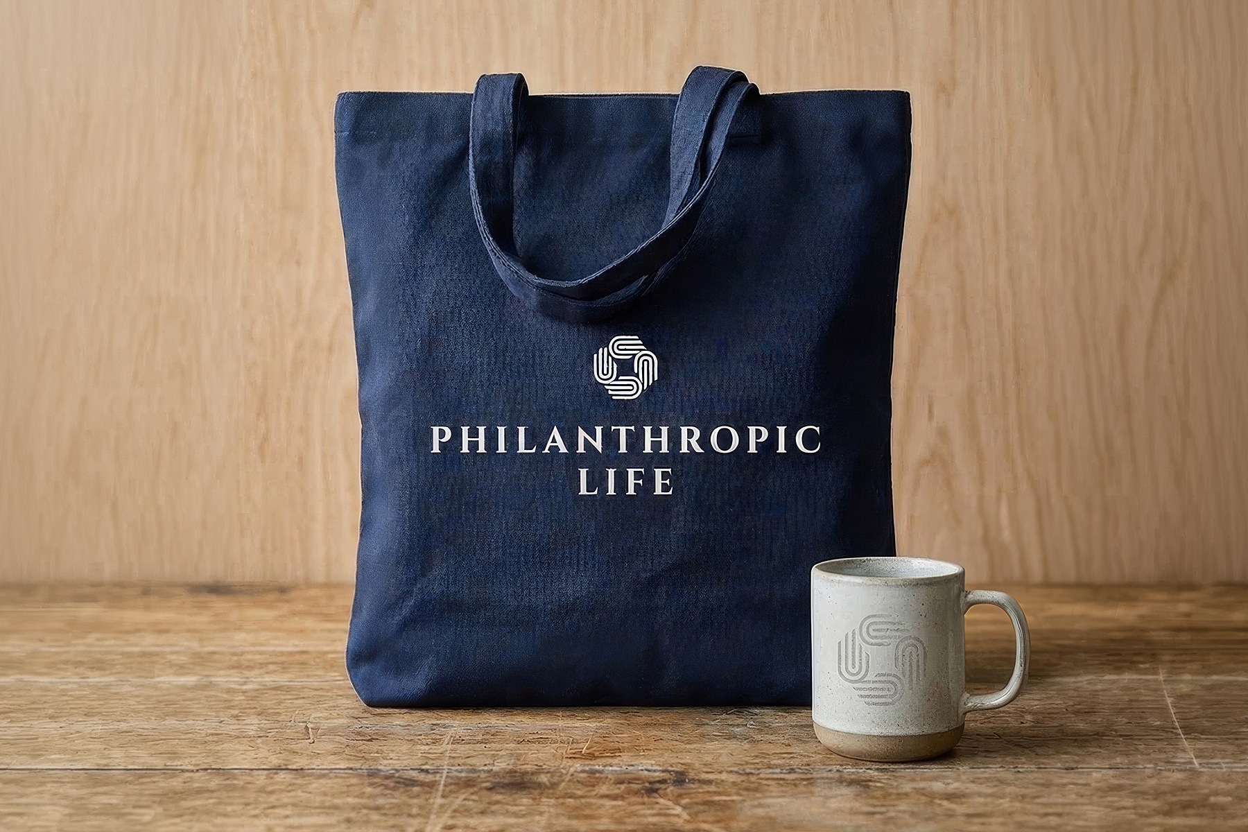
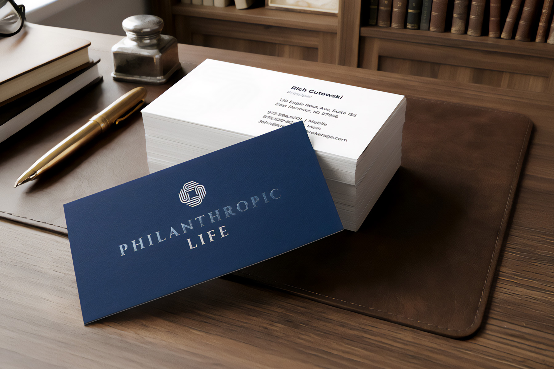
The central icon — conjoined hands in a circular mark — signals compassion and partnership at a glance. It needed to work without the wordmark. Stand on its own on a business card, scale to a banner, hold weight on screen. Paired with a Cinzel wordmark, the full lockup resolves the tension between ethical mission and financial credibility immediately.
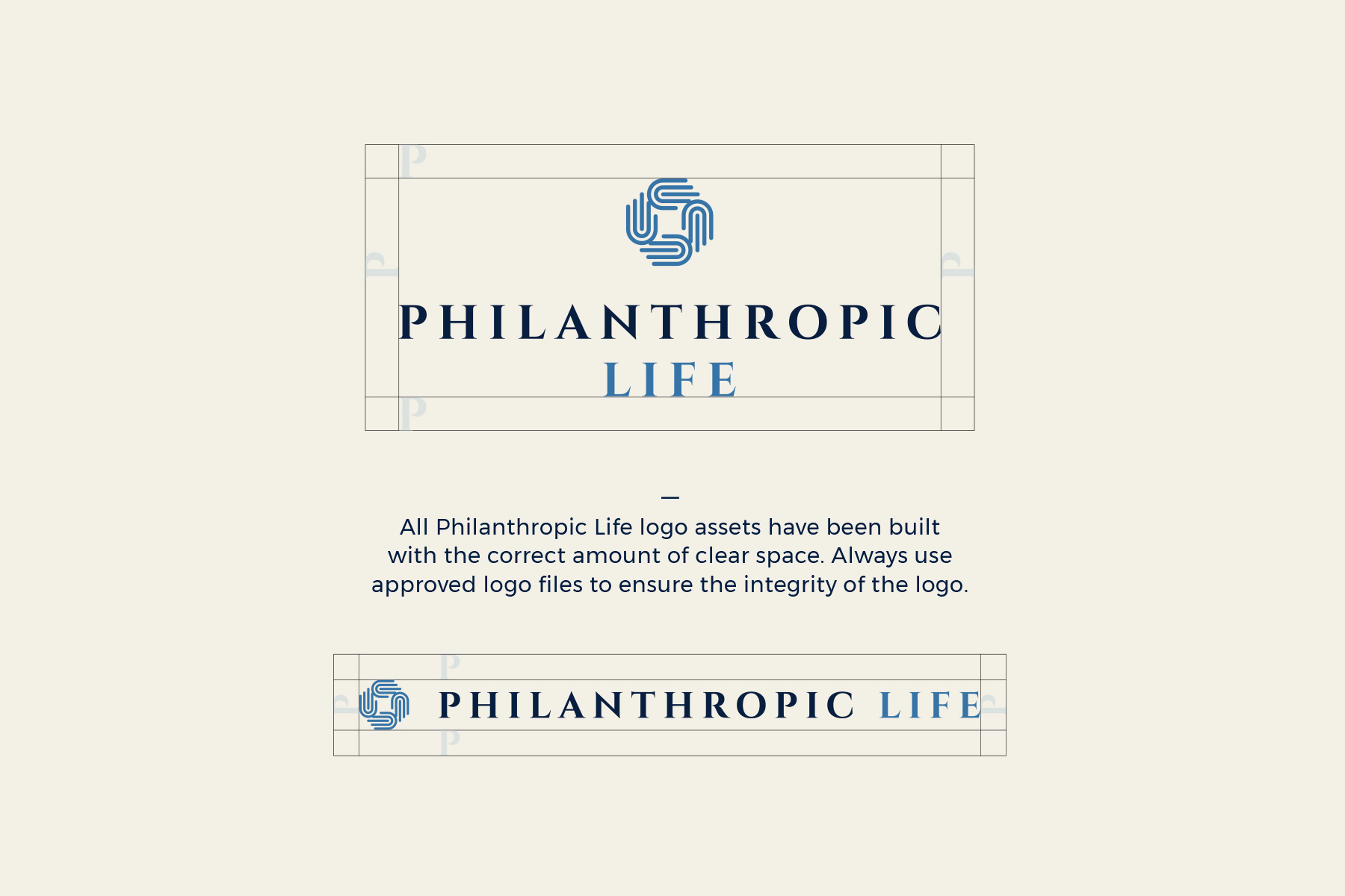
The full logo system comprises two lockups — a primary stacked configuration and a secondary horizontal variant — each engineered for independent deployment. Clear space rules were codified to protect the mark's integrity at every scale. From a 1.5" business card to a 6-foot roll-up banner, the identity reads with the same quiet authority.
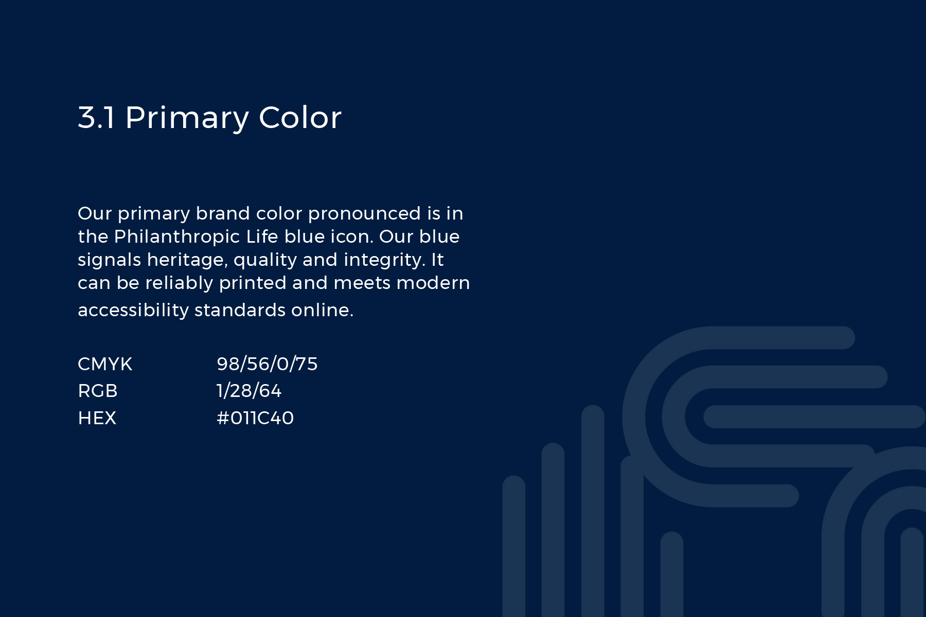
Our primary brand color is Philanthropic Life Blue — Oxford. Our blue signals heritage, quality, and integrity. It can be reliably printed and meets modern accessibility standards online. Not corporate blue. Legacy blue. It signals credibility before a single word is read.
While the brand primarily consists of Philanthropic Life Blue and full-bleed imagery, a secondary palette inspired by finance extends the system. Secondary colors are used with discretion — to punctuate information, support the Oxford Blue, and add versatility and richness where the primary alone would be too singular.
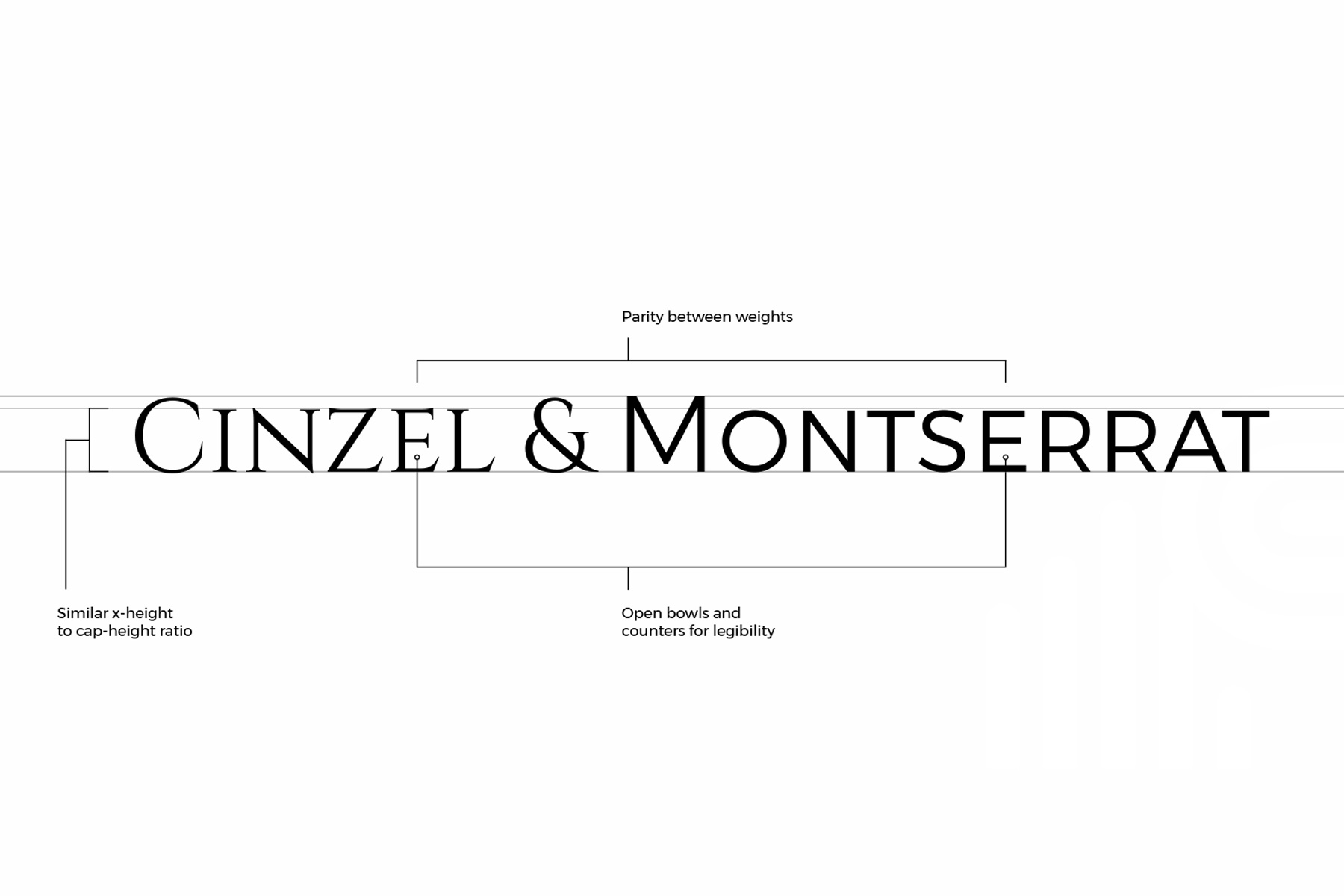
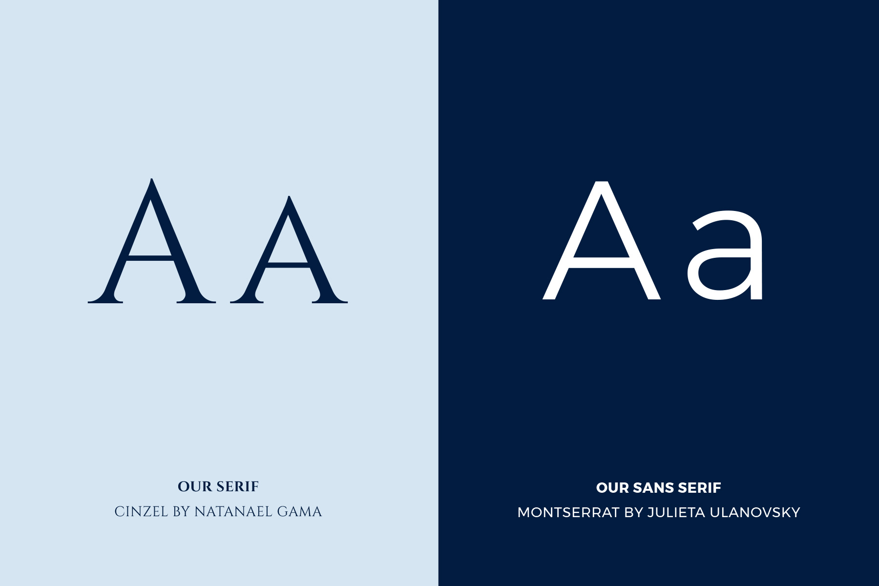
The type system pairs Cinzel with Montserrat. Cinzel, designed by Natanael Gama, draws from first-century Roman inscriptions and classical proportions — ancient history in the latin alphabet with a contemporary edge. Montserrat, by Julieta Ulanovsky, brings the contrast and life of hand-lettered urban signage into a precision sans-serif. Together they handle the full hierarchy: gravitas at the top, clarity throughout.
Complete brand system: mark, logo suite, color palette, type hierarchy, stationery, collateral, and brand guidelines
One brand.
Two audiences.
Philanthropic Life operates in a genuinely unusual space — a non-profit that competes with for-profit brokerages on product quality, while also asking donors to believe in a mission. The identity had to close that gap. The brand system that emerged speaks both languages without an accent.
High-net-worth prospects see the Oxford Blue, the Cinzel wordmark, the understated collateral — and register credibility. Mission-aligned stakeholders see the hands mark, the warmth in the messaging hierarchy, the humanity embedded in every touchpoint — and feel the purpose. Neither audience is being sold a version of the truth. The brand is the truth.